Episode 2 – Weights and Measures
The second episode of Cross Tabs went up yesterday (February 12) – it was supposed to go up sooner but things have been busy and well, you know how it is. We’re about to engage an editor (the fantastic Alison Preisinger of AMPStudio, who also edits In the Demo), so that will help us get things done quite a bit faster.
There’s some really good news, however – we have our first guest interview with an expert in turnout modeling coming up in the next episode, and then another expert in campaign analytics and vote by mail after that, and we’ve had a lot of really generous people interested in talking to us and in offering terrific questions.
Next week, I’ll have more to say about that.
I do encourage you to listen to the new episode, available anywhere you get your podcasts, since we start to answer some of the questions our listeners have already shared with us.
In this episode, Paul and I discuss challenges in survey design, including vague questions, different forms of question wording, and the difficulty of accurately measuring complex attitudes.
The Electorate Will Not Be Satisfied
In particular, we took a look at this article from Gallup in January, about people’s satisfaction with democracy. Here’s the key chart:

What do you notice about this poll? Maybe you notice the record low number all the way over on the right-hand side of the chart. That makes sense, that what the headline wants you to pay attention to.
But here’s what Paul and I fixated on.

The Gallup organization does not ask this question on all of its polls. It asked it in 1984, and again in 1991, and a few more times between then and 1996. But then it did not ask it again until 2021. And it didn’t ask it in 2022, either.
But they report it as a time series, which makes it look like a steady decline from the late 1990s to the 2020s. But if you look at that series of 6 times they asked the question between 1991 and 1996, there’s quite a bit of volatility in the number. What is to say that there was not volatility in this number all along? That chart could look like just about anything – a straight line, a trough with some recovery and another decline, a jagged line… heck, it could have jumped up to a record high level of satisfaction anywhere along that timeline. But they didn’t ask it every year, so we don’t know.
If we can’t answer “when did that change?” maybe we can see among whom it changed. Let’s take a look at how these trend lines look when we account for party affiliation.
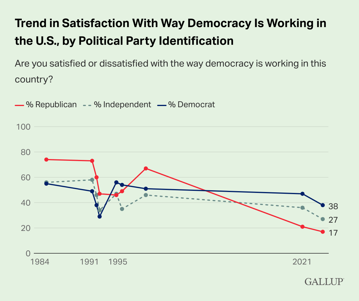
The first chart with rolled up data more or less looks like Independent voters. Democrats appear to be quite a bit more satisfied with the way democracy is working in the US by comparison; but Republicans have crashed from their high points in 1984, 1991, and 1996, dragging the overall average down considerably. Without more points along the time series it’s hard to say why, precisely, Republicans felt so much more satisfied in the earlier part of the time series, and why they feel so much less satisfied now. We can speculate, of course – Republicans liked Reagan, felt good about the end of the Cold War, hated Bill Clinton, and then (cue Underpants Gnomes) they decided democracy isn’t working to their satisfaction anymore. We can attribute that to the results of the 2020 election, but without the time series data in between, it’s hard to say when the drop off genuinely began.
I wanted to point this out because anytime you hear the news report on a trend in polling, or hear comparative language (e.g., “this group is more likely to believe x”) it’s always important to ask a few questions. These might include, in the case of “trend” reporting:
- How long and how consistently and continuously have you been measuring this trend?
- Have you changed anything about how you ask the question over time?
- Can we look inside the sample to see which groups might be driving the trend?
And in the case of “comparative” reporting:
- In the survey, did you include anybody else in your sample, or only the group you’re describing?
- If you did include other groups, how much more likely (or less likely) is this group to say they believe “x”?
As it stands, these charts from Gallup are interesting. They say something.
Perhaps a more telling chart in the series is this one:
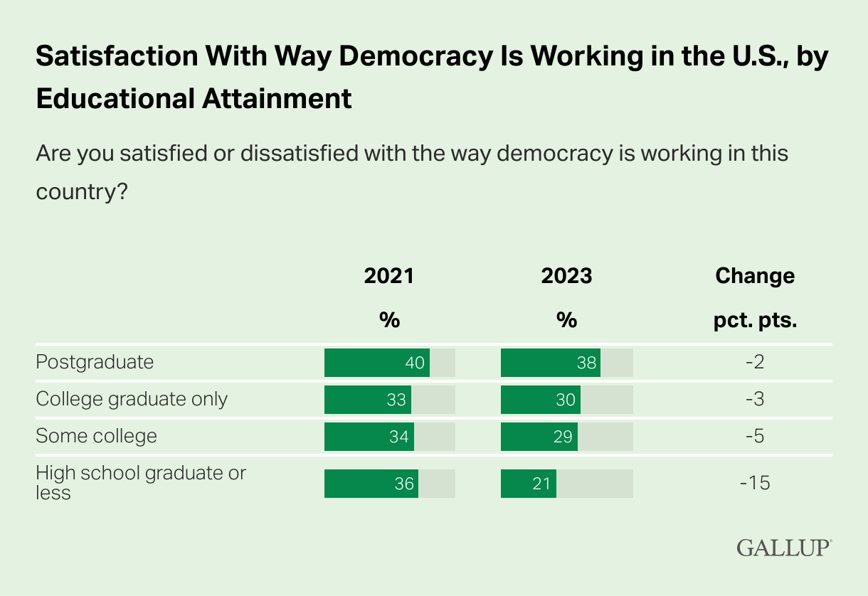
I have a quibble with this chart*, but first let’s talk about what stands out here. People with a high school diploma or less reported satisfaction 15 points lower in 2023 than in 2021. That’s a huge drop! The other groups (here cut by educational attainment) are much closer to where they were in 2021. Questions abound – what happened to people in the bottom tier of educational attainment in that 2-year period (for example)?
It’s possible that the steepest part of the decline in the preceding charts is accounted for solely by this group. But we don’t know. When you download the final topline report, they show you only the topline for this specific question. (It’s QN7 in the survey, so there were other questions.) And then they show you the breakdown by key demographics. Here’s what’s in that chart.
- 29% of men v. 27% of women are satisfied
- 24% of whites v. 35% of non-whites are satisfied
- 29% of 18-34 year olds v. 28% of both 35-54 year olds and 55+ are satisfied
- 26% of those making less than $50,000 v. 25% of those making $50-100,000 v. 31% of those making $100,000+ are satisfied
In many instances, race and income are tied up with educational attainment (i.e., typically, non-white Americans make less money and have lower levels of educational attainment than white Americans). So while it’s not terribly surprising to see those making more than $100,000 per year are 5 pts or so more satisfied with democracy, tracking along with those with at least some college, it is a little surprising that non-whites are 11 points more satisfied than whites. This, too, is interesting. It says something.
But what else did Gallup ask? What did they ask right before QN7? What did they ask after it?
A Republic, If You Can Define It
Paul and I also discussed another important question. What do people picture when they think about “the way democracy is working in the U.S.”?
This research by the Pew Research Center from 2019 looked at how people were feeling about democracies along a variety of values and measures all over the world.
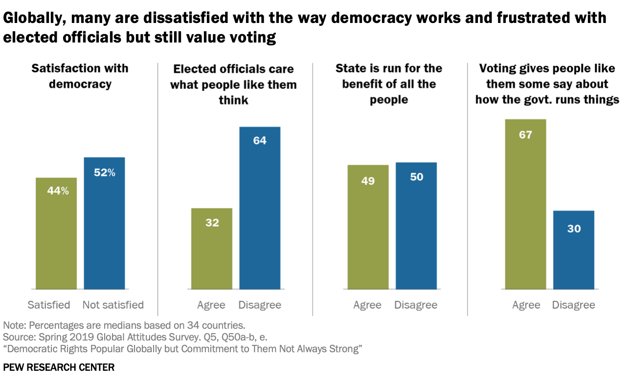
In this study, conducted in 2019, Pew looked at the statement about satisfaction with democracy, but also looked at other statements that reflect elements of living in a democratic polity, like elected officials caring what they think, the sense that voting gives them some say about how government runs things, and a sense that the state is run for the benefit of all the people.
There are no doubt other pr that people think about when they conceive of “democracy”. So Pew asked about a few of them that are common in democracies around the world.
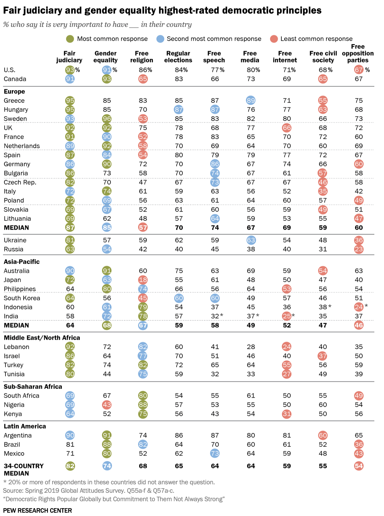
Some of the principles they included in their survey included a fair judiciary, gender equality, free religion, regular elections, free speech, free media, free internet, free civil society, and free opposition parties. At least two out of three US respondents said all of these principles are very important to have in their country. A fair judiciary and gender equality topped the list (nine out of ten said they were very important), but where followed by free religion, regular elections and a free media – all with at least four out of five of US respondents saying these principles were very important.
It appears that a major indicator of dissatisfaction with the way democracy is working across many democracies is revealed by looking at those who disagreed with the idea that elected officials care about what people like them think.
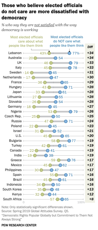
The US is in the middle of the pack here, but US respondents who agreed with this statement were 20 points more likely to say they were dissatisfied with democracy.
I include these examples here because it’s always important to look at the question formation, and to ask yourself what you think the question means? If there’s room for difference between what the pollster meant when they asked the question, and what the respondent meant when they answered it, then you can’t say with a high rate of confidence that the answer means what the pollster thinks it means.
Okay, okay, I’m a qualitative research-lover – so of course I want to know what people mean. What difference, you might wonder, does it make to the bottom line, which is that satisfaction with the way democracy is working in the US seems to be on a relatively steep decline?
The Data Will Tell Us What To Say
It matters because the thing about public polling is that it helps form narratives. The story we tell about why that dissatisfaction is growing, what is causing that dissatisfaction, and among whom the dissatisfaction is growing the most (or among whom satisfaction remains strong), will dictate how we talk about people’s commitments to democracy, their political preferences, about whether democracy is “weak” or “strong”, and what we should do in civil society, as a polity, among the elected, to increase people’s sense of satisfaction.
It will also give fodder to those who perceive dissatisfaction as something that accrues to their political benefit or furthers their political goals. They may try to press harder on the assumed causes of the dissatisfaction, for example, by emphasizing in their speeches, advertising and online messaging that elected officials don’t care about what ordinary people think.
What’s missing from these polls is often just as important as what is included in them. I’m not saying we shouldn’t be worried about these numbers – but what I am definitely saying is we should always be more thoughtful and critical in the way we read the reporting on public polling. Polls often raise more questions than they answer – coming to them with a curious mind is going to be more edifying and (in my opinion) less stressful than coming to them as if they are the dog’s honest truth.
A few other links we mentioned:
- Poll: Majority of Iowa GOP caucus-goers don’t believe Biden legitimately won in 2020 [Washington Post]
- A book I read that might be hard to get your hands on but is a terrific history of American political polling – The Superpollsters: How They Measure and Manipulate Public Opinion in America by David W. Moore

And a couple of podcast recommendations if you’re feeling nervous about political polls this season that I thought were pretty good (not as good as us, of course) at explaining a few things about polls:
- Five tips for understanding political polls this election season [Planet Money, NPR]
- Polling, Money, Trump Fatigue: Your 2024 Election Questions [The Political Scene, The New Yorker]
*Pet Peeve here:
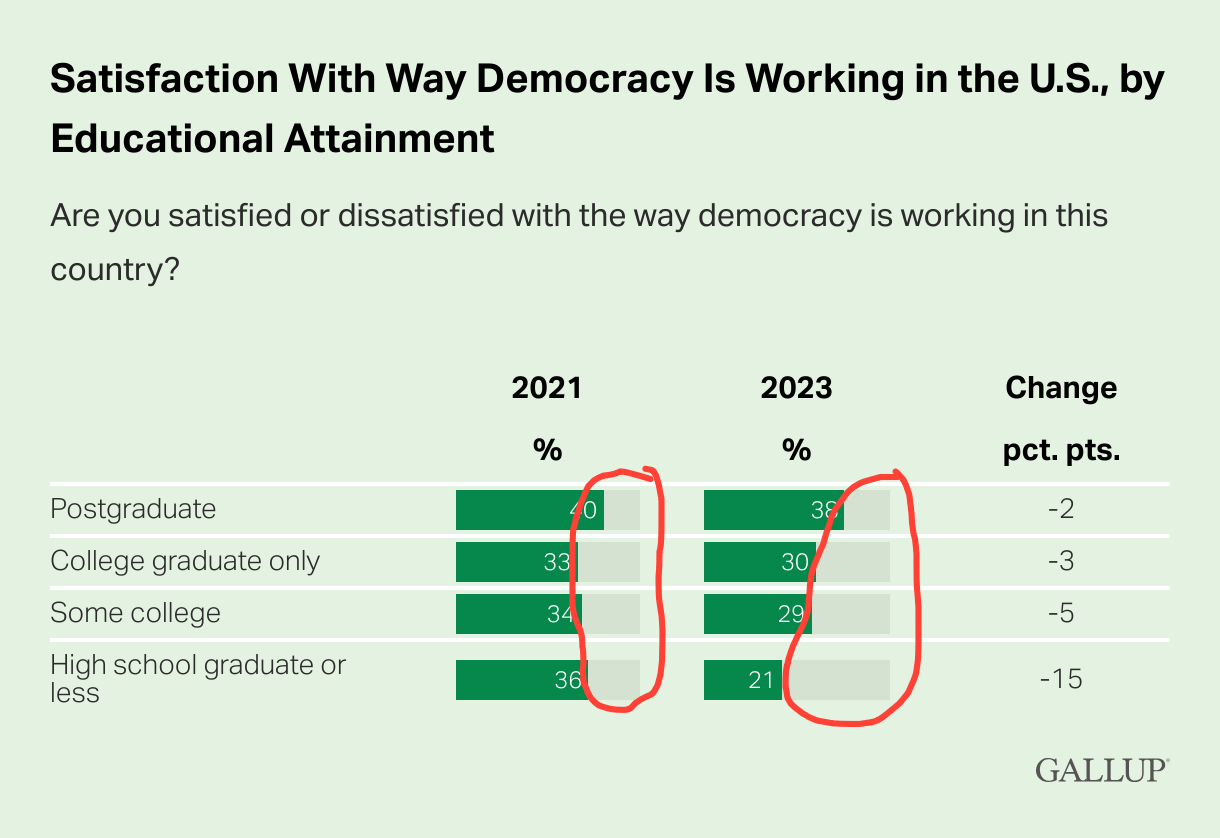
What are these grey horizontal bars representing? 40% is not almost all of 100%. 21% is not almost half of 100%. Please, people, there are settings in your software for how you present data. If you want to show it as a percentage of the whole, make the scale go up to 100%. If you just want to show the comparison between the groups, take off that shading, but make sure that 20% looks like it’s about half of 40%. I don’t ask for much.


